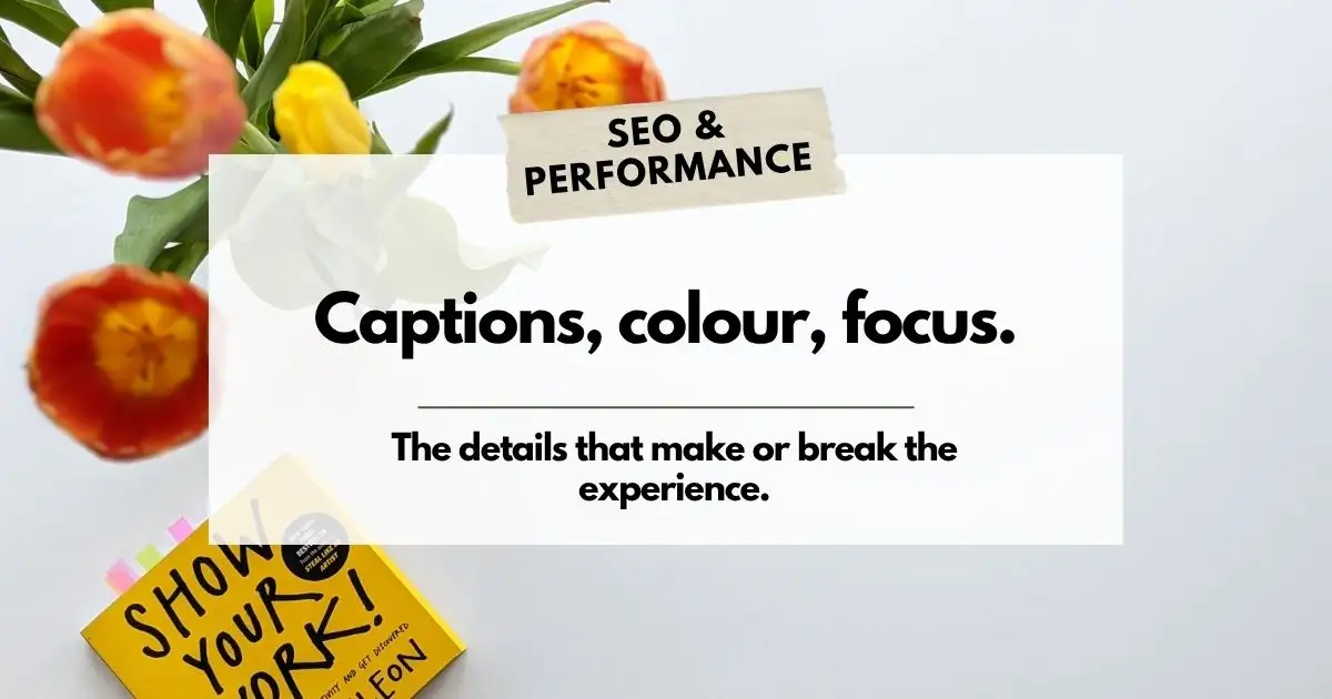
Web accessibility design: colour, captions, and focus explained
If you have read our post on why web accessibility matters and the content side of making your site more accessible, this one is about the visual and interactive layer. Colour choices, video captions, and something called keyboard focus, and none of these are complicated once you know what you are looking at.
Web accessibility design is about making sure the experience of using your site works for people, not just the content of it.
Do your videos need captions?
Short answer: it depends. Here is how to know.
If a video on your site is purely decorative; such as a background loop with no audio, no message, no story — captions are not required. But if your video communicates something, tells a story, or delivers any audio content your audience is meant to hear and understand, captions are required.
Without them, you are excluding a real portion of your audience: people who are deaf or hard of hearing, people who process information better through text, people watching in a noisy coffee shop with their sound off, and people using a work computer they cannot turn up. That’s not a niche case. That’s a lot of people missing your message.
Captions are also good for SEO. Search engines cannot watch a video, but they can read a transcript. If your video content is valuable, captions make it findable.
Colour contrast in web accessibility design
Raise your hand if you have ever squinted at a website trying to read light grey text on a white background. (Since hitting my 50’s HOLY this happens a lot!)
High contrast colour schemes are a core part of web accessibility design because they make your content readable for people with colour vision deficiencies, and honestly for everyone else too. Here is what to aim for:
- Use dark text on a light background, or light text on a dark background
- Avoid similar shades or colours that blend into each other
- Use a colour contrast checker to verify your site meets accessibility standards
The WebAIM Colour Contrast Checker is free and takes about thirty seconds to use. Type in your text colour and background colour and it tells you whether you pass or fail. Simple.
Keyboard focus: the thing many have never heard of
When someone navigates your website using a keyboard instead of a mouse, which is how many people with motor disabilities use the web, they need to know where they are on the page at any given moment.
That is what keyboard focus is. When a user tabs through your links and buttons, there should be a visible indicator showing which element is currently selected: a colour change, a border, an outline, something. Without that visual signal, keyboard users are essentially navigating blind, clicking into the unknown and hoping for the best.
This is one of those web accessibility design details that developers handle at the code level, but it’s worth knowing about and worth asking your designer to confirm is in place.
We could help with that.

Written by: Brenda Sargeant
Brenda runs Unlimited BS Web Design out of Central Alberta, where she builds WordPress sites for businesses and non-profits. She loves to share her knowledge about industry BS in an easy to understand way so business owners know what they’re paying for. Her clients have been sticking around since 2011, which she takes as a sign she’s not the worst to work with. Find her on Google.