Accessible website content: small changes that make a big difference
Accessible website content does not always mean a full rebuild or a massive budget. Sometimes it is a single word change on a button. Sometimes it’s how you break up a paragraph. The small stuff adds up fast, and the good news is that most of it makes your site better for every single visitor, not just those with disabilities.
Here are a few of the easiest wins.
I beg you, stop using acronyms and jargon
I mean it. DNAUKWYASF.
Do not assume users know what your acronyms stand for. (Yes, we made that up. No, we are not sorry.)
The real version of this tip is simple: write clearly! Use language that a first-time visitor can understand without a glossary. Avoid industry jargon, unexplained acronyms, and technical terms that only make sense to someone already inside your world.
Clear and concise content is accessible website content. It serves users with cognitive and learning disabilities, non-native language speakers, people who are just in a hurry, and really everyone who has ever bounced off a website because it felt like reading a legal document.
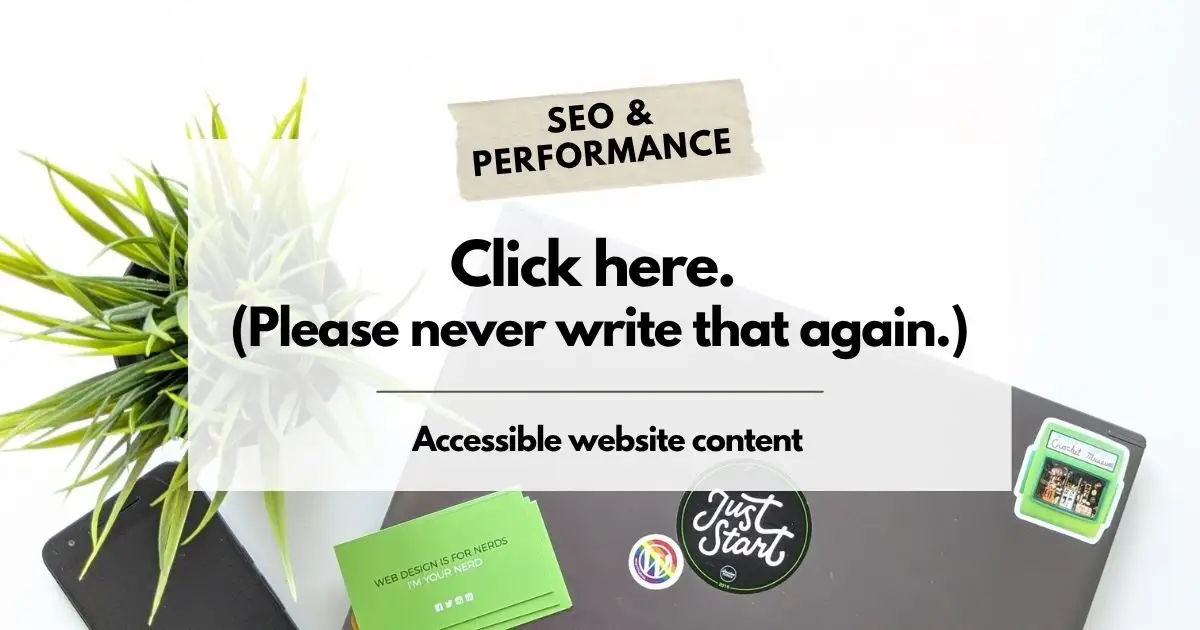
Stop saying “click here”
Picture a screen reader announcing every link on your page. “Click here. Click here. Click here. Read more. Click here.” Helpful? Not remotely.
Descriptive links are one of the simplest accessible website content fixes you can make. Instead of “click here,” write the actual thing. “Learn more about our web design services.” “Download our accessibility checklist.” “Book a free consultation.” The link text should tell the person exactly where they are going or what will happen when they get there.
This also happens to be better for SEO. Search engines read link text to understand context, so descriptive links help your rankings as a side benefit.
A quick test
Go to your site right now and read your links out loud, out of context. Do they make sense on their own? If not, they need work.
Give your content room to breathe
You know when someone rambles on and on without pausing and you lose track of where they are going and what the point was and whether there even is one?
Your web page content can do the exact same thing to your visitors.
Headings and subheadings are not just visual formatting, they are navigation. Screen readers use them to help users jump through a page efficiently. People who skim (which is most people) use them to find what they are looking for without reading every word. Breaking your content into clearly labelled sections with logical headings makes it easier to consume for everyone.
This is also why the heading structure on your site matters. An H1 for the page title, H2 for main sections, H3 for sub-points within those sections. It creates a logical outline that both humans and assistive technologies can follow. We covered exactly this in how we structure our own blog posts, because accessibility and SEO are more connected than most people realize.
Accessible website content is just good content
That’s the honest summary. The habits that make a site accessible; clear language, descriptive links, logical structure, are the same habits that make a site readable, findable, and worth visiting.
If you want to go deeper on accessibility standards and best practices, the W3C Web Accessibility Initiative is the authoritative source and a genuinely useful starting point.
And if you are not sure where your site stands right now? That’s a good conversation to have.

Written by: Brenda Sargeant
Brenda runs Unlimited BS Web Design out of Central Alberta, where she builds WordPress sites for businesses and non-profits. She loves to share her knowledge about industry BS in an easy to understand way so business owners know what they’re paying for. Her clients have been sticking around since 2011, which she takes as a sign she’s not the worst to work with. Find her on Google.